Following the D1b design portfolio review, myself and a couple of other students visited the local Niall Mclaughin Architect’s Bishop Edward King Chapel outside Oxford.
A trip to a building

Following the D1b design portfolio review, myself and a couple of other students visited the local Niall Mclaughin Architect’s Bishop Edward King Chapel outside Oxford.

The Knife Angel – a sculpture created by artist Alfey Bradley standing over 8 metres tall and comprising over 100,000 knives collected from police stations around the country – has been installed outside of Coventry Cathedral opposite the main university buildings.


The artwork is commenting on the state of knife crime numbers in the UK and highlighting the issue to be explored in a public forum. It includes knives collected from all police forces around the country and was a collaborative effort used as a tool to contribute towards reducing the number of people affected by this form of violence.

The artist worked in collaboration with The British Ironwork centre as well as the Home Office and individual police forces to provide knife banks in order to encourage disarmament. A social media campaign was launched to coincide with the exhibition and aimed to further raise awareness – the details of which can be found in the source link at the bottom of this piece.


The feature is prominently placed next to the cathedral adding to the cultural impact the area already holds and benefits from a large pedestrian thoroughfare, especially from tourists and students.

More can be read about the Angel here including how it has been built and where the exhibit plans to travel:
https://www.britishironworkcentre.co.uk/show-areas/the-knife-angel-official

This is the final collection of holiday images used as precedent for my Ben Nevis cafe scheme.

One of the key aspects that I consistently noticed throughout all of the cafes visited on the Alps was the thickness of the walls. The highlight materiality was invariably some form of stone or timber, playing to the local vernacular.


I couldn’t help thinking that some of the facing material must simply be facade. Stone comes with a multitude of issues including cost, transportation and installation difficulties although it is obviously hardwearing and thermally heavy. It was the first choice material for my cafe design but was eventually replaced, mainly as a result of the transportation/installation complications. Additionally (as can be seen in Passo Tonale), the stone must be in keeping with the landscape, normally meaning it must be as close to geologically identical as possible to the ground on which the structure is built.

The roofs also had small interesting grooves running perpendicular to the direction of the pitch. Counter to the age-old recommendation to get precipitation off of the roof as quickly as possible (to minimise risk of standing water leading to eventual leaks), these channels aim to hold the snow and allow it to melt exposed to the sun. I imagine that this is primarily a safety concern due to large banks of snow potentially falling on unwary cafe visitors below as they’re enjoying their hot chocolate!


An interesting material used was some sort of corrugated metal (Aluminium? Zinc?). This was primarily used on the north side of the building – hence the deep shadows – which was also hidden by a raised section of the ski slope. Although modern in appearance, I imagine that it would have been selected for economic purposes, perhaps as a prefabricated panel that would ease on-site construction which is a key tenet of the design philosophy adopted in the Ben Nevis scheme.


Of course, the views are emphasised with key external seating orientated towards the south. Interestingly, the cafes don’t seem to be consistently suited to their use in the snow season – throughout the places visited there is no dedicated storage for either skis/poles/boards or the multitude of bags, helmets, jackets, thermals etc so the placement and arrangement of such items are done organically which, in its own way, creates a hectic romanticism.


The second and last installment in the uploading of the landscape photos taken in Paso Tonale, north Italy.

The mountain changed its emotion with the lighting which in turn was affected by the time of day, the overhead cloud cover, and the month.


The way that a camera picks up light is fundamental to the final raw image you’re likely to capture. These images are taken in close to perfect conditions for the phone camera used.

Phone cameras have a tendency to either blur or add what’s called ‘noise’ or ‘grain’ to images in low light although of course they’re extremely compact and chances are you’re carrying it with you wherever you are. Several photos of night skiing were unuseable because of the poor light detection in my Samsung Galaxy S7 phone.

The snow sports season is typically from December to March although the higher altitude areas (above the point at which the majority of spruce trees can be seen to grow) can have snow last for a month or so longer than usual.


The Paso Tonale resort is within a valley between two mountain sides which are both used for snowsports. The north side had around ten slopes whereas the south side had perhaps three closeby to the centre of the village (if the single road with restaurants, sport hotels and trinket shops could be called a ‘village’).

Because of the number of slopes on the north side, most photos are taken from those slopes looking south meaning that the mountain faces are commonly in shadow. Others photos suffer the opposite fate – any photos of the north slopes are blasted with even lighting.


The best lighting for landscapes is commonly one that can bring out the textural qualities in your subject. Unless you’re aiming to heavily emphasise one section of your composition over another (or over the entirety of the rest of the image), then lighting orientated perpendicular from your view direction is usually your best best to bring out the character of surfaces.


The diffusion of light can really be seen in the above images. Although this can be tweaked in editing software, it is challenging (and considered unethical by some!) to do so. The top left in the cluster is taken with the light heavily diffused in the cloud cover which gives the overall image a whiter light. The primary image however, has light mainly reflected from the sky which gives the composition a subtle blue tint.

Whilst on holiday, I visited many buildings which have been designed to suit sub-zero temperatures and high wind pressure which can be used as direct precedent for the Ben Nevis cafe T1/T2 submission.

The ski resort had many cafes itself, one of the most prominent being at the end of the majority of the starter slopes.


Externally, the palette is splattered with odd bits and pieces of Italian vernacular material: weathered timber and heavy stone cladding. This was fused with contemporary tinted glazing and a large oblique metal-clad wall highlighting the service ducting that expels above the sloped roof.


Internally, the bold clash between industrial new and warm, textured old continues with exposed services and suspended pendant lighting adding to the height of the space being framed by free-standing timber columns and sloping rafters.

One aspect of the space struck me: it was busy. Pleasantly so, but half of the chair and table space was being used for setting aside thermals and other skiing gear, leading to more than one experience of having to move items in order to accommodate other parties arriving and leaving. The cafe design for Ben Nevis would have to have a separate dedicated space to allow for this.


The glazing was constructed from structural panes with a large cavity, fixed back to its own proprietary secondary set of circular columns. Thermally, this would be the best way to achieve a good U-value in a large piece of glazing, having limited the number of thermal bridges that you would otherwise have in a standard curtain walling system.

The glazing itself was heavily tinted, probably to limit extreme solar gain (at 3000m above sea level, the sun has a different intensity when there is little cloud cover). A perhaps accidental impact of this design choice was the way in which the facade reflected back the evocative landscape when viewed at an angle.

The glazing tied in with the structural cross-bracing, exposed and bolted into the primary timber-clad framing.


The cross bracing is slender and hardly noticeable given the emphasis on the views beyond. The structural connections were not completely concealed but neither were they emphasised, giving delight to the observer who sought out the smaller details.


I haven’t updated this blog in a little while because I’ve been away in Italy with family on a skiing trip. The trip gave me a chance to reflect on where I was with my RIBA Studio work and also drew attention to several chances to obtain good precedent for my Ben Nevis cafe project as part of T1/T2.

One of the key developmental aspects that has come from my architectural investigations is photography: more specifically, landscape photography.


How a composition is put together and how lighting affects one’s perception is extremely transferable from the natural to the built environment.

I believe it is innate to be in awe of nature: with what is built, you are attempting to guess the mind of the architect; with a mountain range, you are attempting to guess the mind of God.


Slight deviations in where shots are taken from, the direction, strength and dispersal of lighting and the omission or inclusion of a foreground all have minor or major impacts on the total feel of an image that depends on the observance or attitude of the viewer: you get something different from the experience than I do. Three of the images included in this post are taken from almost the same spot and yet I believe they each give a different story.

I have done some minor post production editing to these images using Photoshop, mainly tweaking lighting levels and contrasts. If there’s any demand for doing a post showing what I’ve done and how I’ve done it then I may consider doing one in the future.

The above image is perhaps one of my favourites. It may not give as much as others in regard to the sweeping landscapes but it includes a powerful foreboding of the journey about to be undertaken and the partially concealed prize to be claimed in the near future that is just out of reach. I believe the fore-, mid- and backgrounds are also nicely balanced.


The photos were taken on a phone camera: a Samsung Galaxy S7. I have been looking to buy a ‘proper’ camera – an entry level Canon EOS2000D has caught my eye – but in reality, I would not have been able to ski while carrying a larger camera.


These last two images are really full of emotion for me. There should be another instalment coming in the near future!
Around Christmas time I spent an afternoon walking through the Welsh countryside with family.


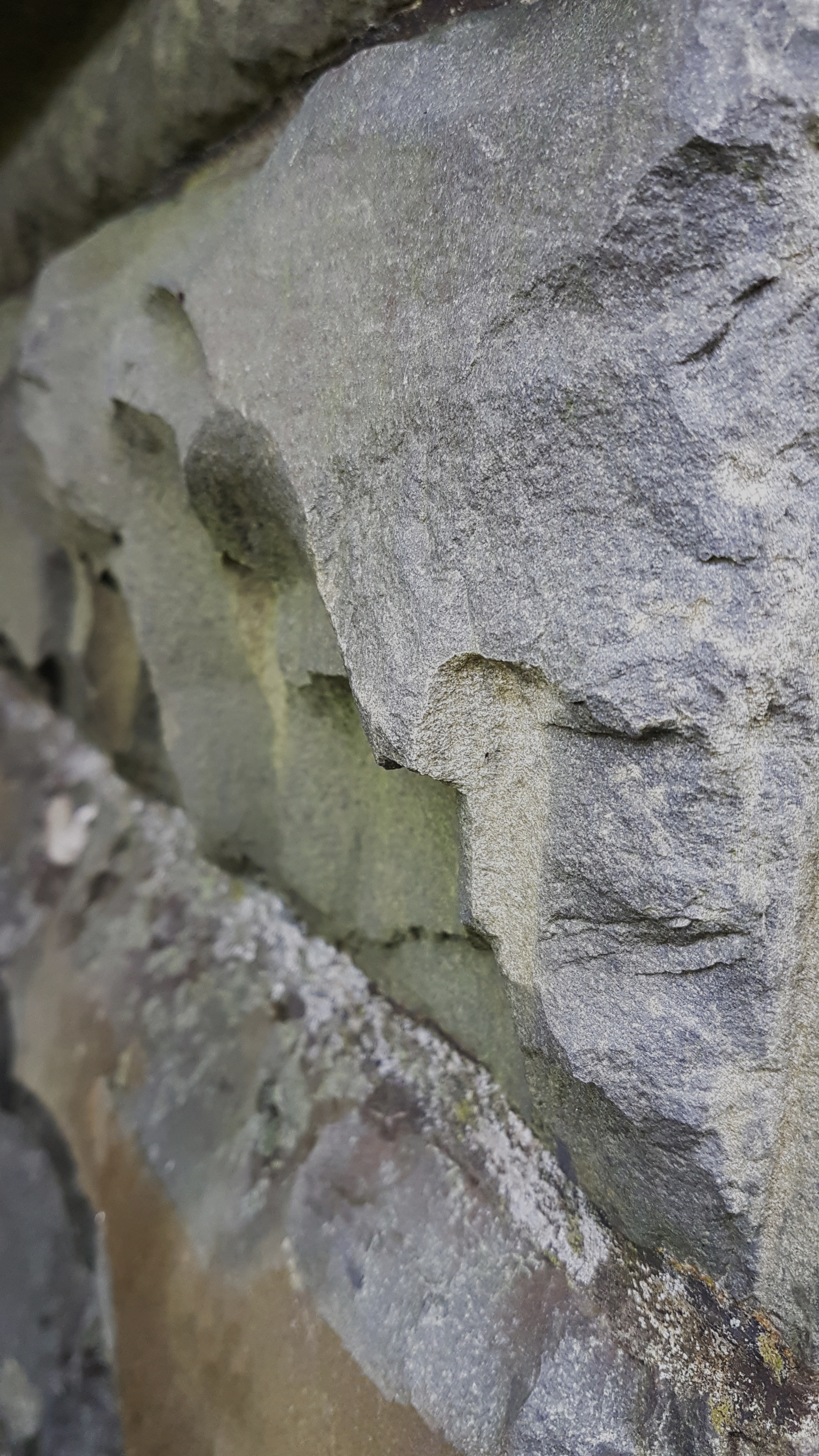
The vernacular construction materials and methodology were on display: the mesh of a group of natural stone being arranged in extremely unnatural compositions to form the built environment.
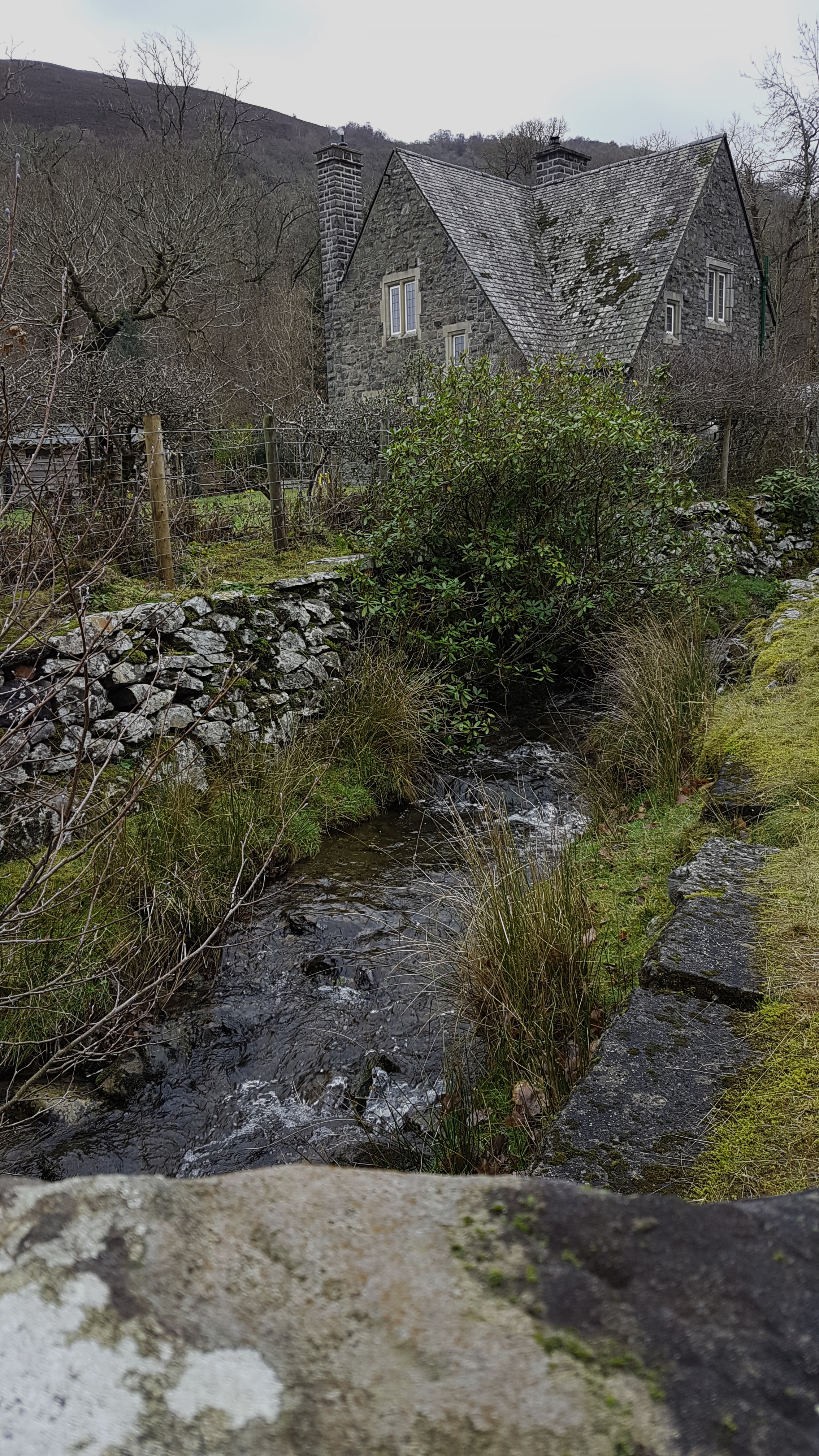

The local architectural language was that of heavy greys – allowing chosen constructed elements to either harmonize in a radical manner as to disappear or stand out as an obvious focus.

This small pavilion building chooses to hide its painted wooden columns, instead bearing forward with its lumbering central stone fountain. The rafter feet are finished in white and form a ring of stark contrast around the edge of the roof. This choice, combined with the large overhang, makes the pitched roof seemingly float – as an element, providing shelter while admitting subservience and dependence to the thickset walls below.
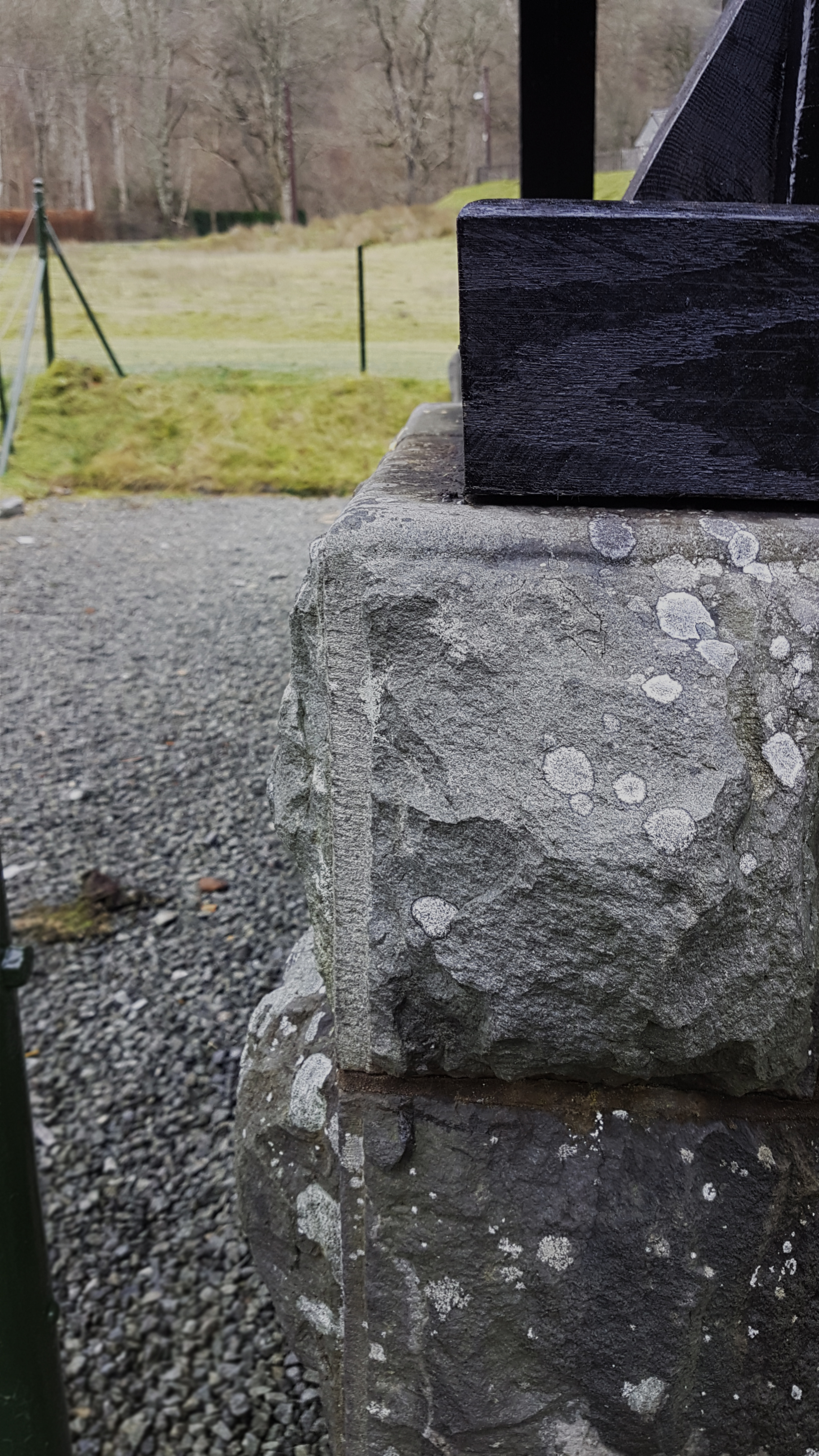


The conflicting elements of steel and stone were constantly applied: one, the most stalwart representation of creation’s resilience in the face of her own forces, the other, an ageing material that harks back to the turn in time when man truly began to unshackle himself from nature’s infedelity.

These materials and construction methodologies are broadly similar to Highland vernacular which will be applicable within my first assessment: the Ben Nevis cafe.

Christmas eve day was spent with family exploring the crown jewel of cultural Coventry: the Cathedral.

Coventry is on its third cathedral, the latest being formally consecrated 25th May 1962. Designed by Basil Spence and Arup, their competition entry was one of the few insistent on the retention of the old as a powerful memorial.

Light is an almost inescapable material used within religious architectural language. The coloured glazing can be seen to highlight, forming playful accentuations and referencing the age-old cathedral craft of stained glass.

